How to Effectively Find the Interquartile Range for Analyzing Data in 2025
The **interquartile range (IQR)** serves as a crucial statistical measure that helps to understand data dispersion. It is particularly useful in identifying the variability of a data set and detecting potential outliers. In this article, we will explore the essential components of how to find the interquartile range, including its definition, the steps to calculate IQR, and its significance in statistical analysis and data interpretation.
Understanding the Interquartile Range
The **interquartile range** is defined as the difference between the upper and lower quartiles of a data set. Essentially, it captures the range of the middle 50% of a data distribution, thus providing insights into the spread of the data while minimizing the impact of outliers. To define quartiles, it’s essential to understand that they divide the data set into four equal parts. The lower quartile (Q1) is the median of the first half of data, while the upper quartile (Q3) is the median of the upper half. The formula used for calculating the IQR is simple:
IQR = Q3 – Q1. This measure is indispensable for statistical analysis and is commonly employed in various fields, including research and data science.
Steps to Calculate IQR
Calculating the **IQR** involves a few straightforward steps:
- **Organize Your Data:** Start by sorting your data set in ascending order. Arranging the data is essential for accurately determining the **quartiles**.
- **Find the Median:** Calculate the median of the data set, which serves as a benchmark for splitting the data into two halves.
- **Calculate Q1 and Q3:** Determine the **lower quartile (Q1)** and the **upper quartile (Q3)**:
- Q1 is the median of the lower half of data.
- Q3 is the median of the upper half of data.
- **Compute IQR:** Utilize the IQR formula mentioned earlier to complete the calculation.
This structured approach ensures a comprehensive understanding of both the raw data and the resulting statistical metrics derived from it.
IQR Example Problem
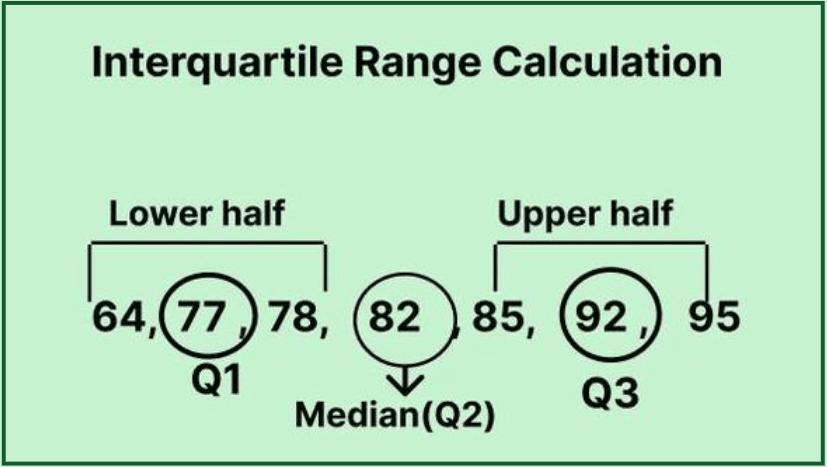
Let’s look at a practical example for further clarification. Assume we have the data set: 4, 8, 6, 5, 3, 7, 9, 11, and 3. Here’s how we would calculate the IQR:
- Organizing the data: 3, 3, 4, 5, 6, 7, 8, 9, 11.
- The median (Q2) is 6.
- Lower half: 3, 3, 4, 5. Q1 = 3.5 (average of 3 and 4). Upper half: 7, 8, 9, 11. Q3 = 8.
- Calculating IQR: IQR = Q3 – Q1 = 8 – 3.5 = 4.5.
This example illustrates a clear path to calculating the **IQR**, providing valuable insights into the data’s spread and variability. By using the **IQR calculation method**, analysts can identify potential outliers more effectively.
The Significance of IQR in Data Analysis
The IQR holds a prominent place in the field of **statistical analysis**. It not only highlights the central part of the data distribution but also reveals critical information about the data’s spread. Whether you are a novice in statistics or a seasoned data analyst, understanding the *significance of IQR* will enhance your analytical insights.
Statistical Analysis Using IQR
Utilizing the **IQR for outliers** is fundamental in statistical analysis. Outliers are data points that fall below Q1 – 1.5 * IQR or above Q3 + 1.5 * IQR. These outliers can skew statistical results if left unchecked. Using the IQR in conjunction with box plots can illustrate the distribution of the data succinctly, as box plots neatly represent **quartiles**, the median, and potential outliers, enabling clearer communication of data insights.
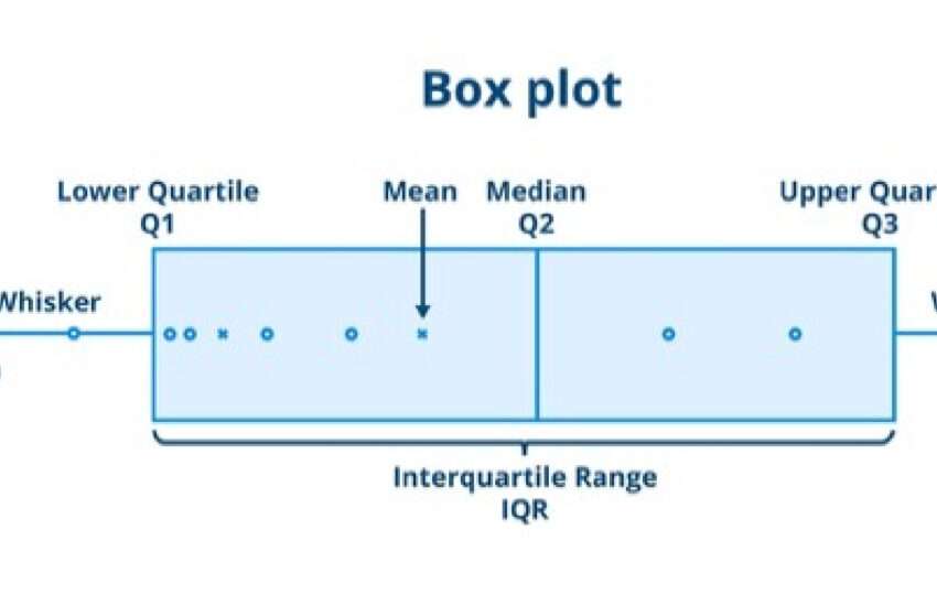
Visualizing IQR with Box and Whisker Plots
A **box and whisker plot** is a graphical representation that emphasizes the **IQR**. The plot provides a visual summary of a data set’s variability, medians, and quartiles. The box represents the IQR, while lines extending (the “whiskers”) denote the full range of data, excluding outliers. Here’s a simple visual representation:
Utilizing box plots makes it easier for researchers and analysts to interpret the data variations and make informed decisions based on systematic observations.
Interpreting IQR Results
After calculating the IQR, interpreting the results is crucial for **data interpretation**. Whether one is undertaking predictive modeling or conducting research, understanding how the interquartile range informs data-related inquiries can promote better statistical literacy.
IQR and Outliers Explanation
Identifying outliers through the IQR method involves not just recognizing abnormal data points but also discerning their implications. An outlier may suggest a data collection error, the presence of a rare event or phenomenon, or simply reflect natural variability. Emphasizing the **IQR vs. standard deviation** debate, while the former is robust against outliers, the latter incorporates all data points, providing a specific context for evaluating data skewness.
IQR for Grouped Data
For large data sets, calculating the **IQR for grouped data** may become relevant. In this instance, it’s important to apply the same underlying principles of determining quartiles, while taking into account frequency distributions. By using the grouped data, one can efficiently compute **sample statistics,** making IQR beneficial for summarizing extensive datasets.
Summary and Key Takeaways
In summarizing the information about how to find the interquartile range, here are the key points:
- The **IQR is a measure of data spread**, calculated as Q3 minus Q1.
- IQR is crucial in identifying and analyzing outliers and represents data variability robustly.
- Visual aids, such as **box and whisker plots**, help in interpreting IQR results effectively.
- Understanding the significance of the IQR enhances data analysis in various research contexts.
The importance of mastering the steps in calculating the IQR and interpreting its results has never been more significant, especially for data scientists and analysts in 2025 and beyond. Equip yourself with this fundamental tool for effective data analysis!
FAQ
1. What is an IQR, and how is it used in statistics?
The interquartile range (IQR) is defined as the measure of statistical dispersion, represented by the range of the middle 50% of a data set. It is calculated by subtracting the lower quartile (Q1) from the upper quartile (Q3). The IQR is crucial for identifying outliers and assessing the variability of datasets in statistical analysis.
2. How do I visualize IQR using a box plot?
A box plot visualizes the IQR by displaying the quartiles of a dataset, with the box representing the IQR and lines extending (the whiskers) showing the data range. Outliers appear as individual data points beyond the whisker lines, facilitating a visual understanding of distribution and variance in data analysis.
3. What are the advantages of using IQR over standard deviation?
The IQR has the distinct advantage of being less sensitive to outliers, making it a more robust measure of dispersion for skewed data. The standard deviation takes all data points into account, which can lead to misleading interpretations when outliers are present, thus highlighting the advantages of using IQR in specific conditions.
4. Can IQR be calculated for grouped data?
Yes! When calculating IQR for grouped data, accumulate the frequencies and calculate quartiles from the cumulative frequency distribution. This method allows for efficient IQR calculations in large datasets while preserving essential statistical insights on data variability.
5. How does understanding quartiles enhance data analysis?
Understanding quartiles helps in summarizing distributions, facilitating comparisons across datasets, and assessing data behavior. Quartiles provide critical insights into data spread, trends, and the identification of outliers, further enhancing the effectiveness of data-driven decision-making.