How to Effectively Find the Interquartile Range
Understanding the Interquartile Range (IQR)
The **interquartile range (IQR)** is a vital measure of statistical dispersion, indicating the range of the middle 50% of a data set. Defined as the difference between the upper quartile (Q3) and the lower quartile (Q1), IQR is crucial for understanding **data variability**. By comparing the IQR, analysts gain insights into overall data spread and identify potential outliers. This succinct explanation forms the foundation of **how to calculate IQR**, a fundamental concept in **statistics and probability** that bolsters effective **data analysis techniques**.
Significance of the Interquartile Range
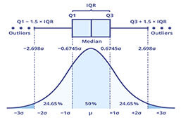
The IQR plays a significant role in descriptive statistics. It provides a clearer picture of data distribution because it excludes extreme values or outliers, allowing for a more robust analysis. Statisticians often rely on the **IQR for outlier detection** as it helps in identifying values that fall far outside the common range of the majority. For instance, in a dataset where the **IQR measures 15**, any values beyond **Q1 – 1.5 * IQR** or **Q3 + 1.5 * IQR** can be considered outliers, giving analysts a reliable method for pinpointing data points that may distort their conclusions.
Understanding Quartiles and their Calculation
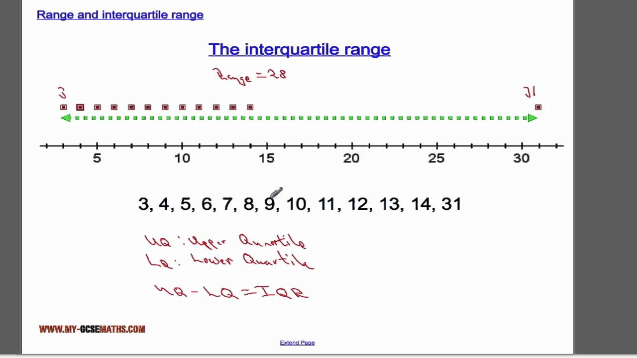
Before diving into **IQR calculation**, it’s essential to grasp the concept of quartiles. Quartiles divide a dataset into four equal parts, giving way to two key values: the **lower quartile (Q1)** and the **upper quartile (Q3)**. To find these quartiles, one must first **calculate the median** of the dataset. The **lower quartile** marks the median of the lower half of the data, while the **upper quartile** is the median of the upper half. A thorough understanding of **calculating quartiles** is fundamental, as it lays the groundwork for accurately computing the IQR.
Steps to Find the Interquartile Range
Calculating the **interquartile range** involves a few straightforward steps, allowing even beginners in statistics to grasp this necessary skill. Here’s how to proceed:
1. Organize the Data Set
First, arrange your **data set** in ascending order. This step is crucial as it directly influences the accuracy of the **IQR calculation**. For example, consider the data set: [5, 7, 12, 14, 18, 21, 24]. By sorting them, it is easier to identify quartiles, ultimately impacting the reliability of your analysis.
2. Calculate the Quartiles
Next, find the median, which separates the data into two halves. The lower quartile (Q1) is the median of the lower half, and the upper quartile (Q3) is the median of the upper half. Continuing the example, Q1 would be 12, while Q3 is 21. Thus, these values are foundational for your **IQR computation**.
3. Compute the IQR
Finally, substract Q1 from Q3 to obtain the IQR: IQR = Q3 – Q1. From our example, this calculation becomes 21 – 12 = 9. The **interquartile range example** demonstrates how this discreet measurement is instrumental for understanding **data distribution**.
Application of IQR in Real-World Analysis
The relevance of the **IQR method** extends across various fields, including finance, healthcare, and academia. It serves as a tool for researchers to encapsulate fluctuations within datasets, ensuring that conclusions drawn from them are sound and informative. For example, in finance, analysts use IQR to compare investment returns among different portfolios, accounting for outlier data to refine their strategies.
Using IQR to Evaluate Outliers
One of the key applications of the IQR is its role in **outlier analysis**. When examining a **data distribution**, the range of the middle 50% effectively eliminates extreme values. Suppose the **IQR measures indicates** that return fluctuations are normal, with values exceeding the outlier bounds directly indicating an **anomaly**. In this way, using the IQR fosters security against perceiving erratic figures as regular occurrences, which can lead to overstated financial forecasts.
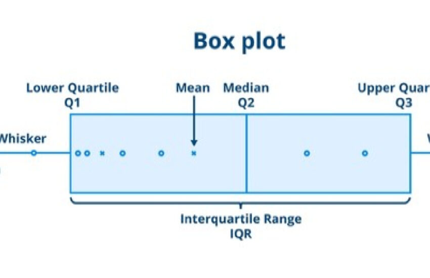
Visualizing Data with Box Plots
Utilizing box plots can greatly enhance your ability to visualize the interquartile range. These plots succinctly present medians, quartiles, and potential outliers through a graphical representation. By leveraging **box and whisker plots**, you can quickly assess the distributions of your entire dataset at a glance, promoting deeper insight into the **data summary techniques** that are pivotal in research.
FAQ
1. What is the interquartile range in statistics?
The **interquartile range (IQR)** is a statistical measure that quantifies the spread of the middle 50% of a dataset. Calculated by subtracting the lower quartile from the upper quartile, it offers insights into data variability without being influenced by extreme values.
2. How do I calculate quartiles from a dataset?
To calculate quartiles, begin by arranging your **data set** in ascending order. Identify the median to split the data in half. Then, calculate the median for the lower half to find the lower quartile (Q1) and the upper half for the upper quartile (Q3).
3. Why is the IQR significant in data analysis?
The **significance of IQR** in data analysis lies in its ability to provide a clear picture of data dispersion, helping researchers detect outliers and understand data spread effectively. This makes it especially valuable in statistics that require precise determination of variations.
4. How can IQR be used in outlier detection?
IQR can identify outliers by calculating the range of middle 50% of data and setting boundaries at Q1 – 1.5 * IQR and Q3 + 1.5 * IQR. Values outside this range are designated as outliers, aiding in refining data interpretation.
5. Can the IQR be used for all types of data distributions?
While the IQR is a versatile tool applicable to numerous distributions, it is most effective with skewed distributions where extreme values might distort the mean. For normally distributed datasets, additional measures such as standard deviation may provide complementary insights.
6. What is a box plot, and how does it relate to the IQR?
A box plot, also known as a box-and-whisker plot, visually represents the distribution of a dataset, displaying the median, quartiles, and any outliers. The interquartile range is prominently featured in this visualization, enhancing comprehension of data spread and variability.
7. Is there a formula for calculating the IQR?
Yes, the formula to calculate the IQR is IQR = Q3 – Q1. This calculates the range between the upper quartile and lower quartile, providing a succinct measure of data spread within the middle 50% of values.
Understanding the **interquartile range** is essential for both novice and experienced analysts alike. Mastering the steps to find IQR empowers you to wield one of the most effective tools in **data analysis**. For further insights on statistical techniques, check out additional resources on our blog.